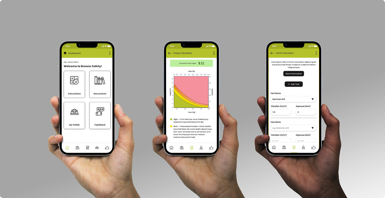
When Apple introduces something new to the iPhone experience, the ripple effect across the mobile world is always huge. The latest iOS glass interface is one of those moments. It’s fresh, it feels modern, and most importantly it changes how apps feel to use.
The new glass style interface brings depth, movement and transparency into the way screens behave. Panels feel layered rather than flat. Menus move naturally. Elements blur and reveal what’s behind them like sheets of glass. It’s subtle, but it completely changes the feel of the phone.
What we like about it most is that it makes the interface feel alive.
Nothing feels static anymore. Screens move, transitions guide you through the experience, and interactions feel smoother and more natural. Apple has clearly put a lot of thought into how people physically interact with their devices, not just how things look on a screen.
From a mobile app development perspective, this kind of shift matters.
At Resolved Beyond we build a lot of our mobile apps using Flutter. The reason is simple. It allows us to build high quality apps that run on both iOS and Android from a single codebase. Instead of maintaining two completely separate apps, we can develop once and deploy across platforms while still delivering a native level experience.
That approach saves time, reduces development costs for clients, and makes long term maintenance much easier.
The good news is that Flutter is more than capable of embracing this new direction in interface design.
The glass style Apple is introducing relies on blur effects, transparency, layered layouts and smooth motion. Flutter already supports all of this. With the right design planning and development approach, we can build interfaces that achieve the same depth and movement that Apple is pushing with the latest iOS update.
What matters isn’t the technology alone. It’s the mindset when designing the app.
Mobile apps today can’t just be functional. They need to feel modern, smooth and intuitive. When operating systems evolve, apps that don’t evolve with them quickly start to feel outdated.
This is why when we plan new mobile apps, or update existing ones, we look at where the platform is going rather than just where it is today.
If Apple is moving toward layered glass interfaces, fluid movement and more interactive design, then apps should move in that direction too. Users adapt to new experiences very quickly, and once they do, anything that feels older stands out immediately.
Flutter gives us the flexibility to keep up with those changes without needing to rebuild everything separately for each platform.
It means we can deliver modern design experiences while still keeping development efficient and scalable.
For agencies and businesses with mobile apps, here are practical ways to embrace a glass style facelift without turning it into a massive rebuild.
Advice for a glass effect facelift
- Start with the goal, not the trend, decide what you want the new look to achieve, faster navigation, clearer screens, more premium feel, or better conversion, then design the glass effect around that outcome
- Pick the areas that will benefit most, glass effects work best for overlays, menus, bottom sheets, filters, pop ups, cards and navigation panels, not everything needs to be glass to look modern
- Keep the interface clean, glass looks best when there is space, good typography, clear hierarchy and fewer competing elements behind it
- Use blur and transparency with restraint, subtle always looks more premium than heavy blur, too much blur can look messy and can also affect performance on older devices
- Design with movement in mind, the magic is in the transitions, slide, fade, blur in and out, layered motion and micro interactions make the experience feel modern
- Maintain strong contrast and readability, glass can reduce clarity if the background is busy, use soft overlays, darkening layers and clear text sizing so everything remains easy to read
- Check accessibility early, test with larger text sizes and different contrast needs, make sure the design still works for everyone
- Plan it as a phased facelift, start with one key user journey, for example onboarding, the home screen, search and filtering, or checkout, then roll the style across the rest of the app gradually
- Prioritise performance, glass effects and motion should feel smooth, if the app starts to stutter the premium feel disappears instantly
- Make sure it works across iOS and Android, if you are using Flutter you can keep a consistent design language across both, but still tune small details so it feels right on each platform
- Treat it like a product improvement, not just a visual refresh, use the facelift as the moment to also simplify flows, reduce friction, fix awkward screens and improve the user experience
If you are an agency with clients on older apps, or a business that has an app that feels dated, this is actually a really good moment to act. A glass effect facelift does not need to be a full rebuild. With the right planning it can be a structured refresh that modernises the experience, improves usability, and makes the app feel like it belongs on today’s phones.
At Resolved Beyond this is exactly how we approach it. We look at what is already working, stabilise what is not, then plan improvements in phases so you get impact quickly without taking unnecessary risks. Whether the app is built in Flutter, iOS or Android, the aim is always the same, make it feel modern, smooth and easy to use, while keeping maintenance simple long term.